

Often, you must have heard this saying– First impression is the last impression, and we know for a fact that it’s true. Speaking of Web Designing, your first impression is your website’s homepage design.
In today’s day and age, the first impression matters and does wonders for companies and businesses who seek to build an audience. Therefore, what is the Homepage? A homepage is what your visitor will land on after clicking a search result.
Since it is the first thing the visitor comes across, you must make sure it is welcoming and impactful. Impactful homepage design will entice your visitor and build brand curiosity, which will eventually lead them to know more about you.
According to stats, 86% of visitors look for your products and services on your Homepage. 64% look for contact information, and 52% want to know more about the business. These figures will help you remember what is essential on your Homepage.
Now that we know what a homepage is, the question is, what makes it the best? Before you venture out to create the best website design, here are some essential elements a modern homepage design should have.
Elements of an Inspiring Homepage Design
1. Introducing your business
Every homepage design should answer these fundamental questions-
1. Who are you?
What is your company, product, or service? In other words, your Homepage must resonate with your brand message.
2. What do you do?
What does your company, product, or service do for its users?
3. How are you better than your competitors?
What makes your company, product, or service different from your competitors in the market?
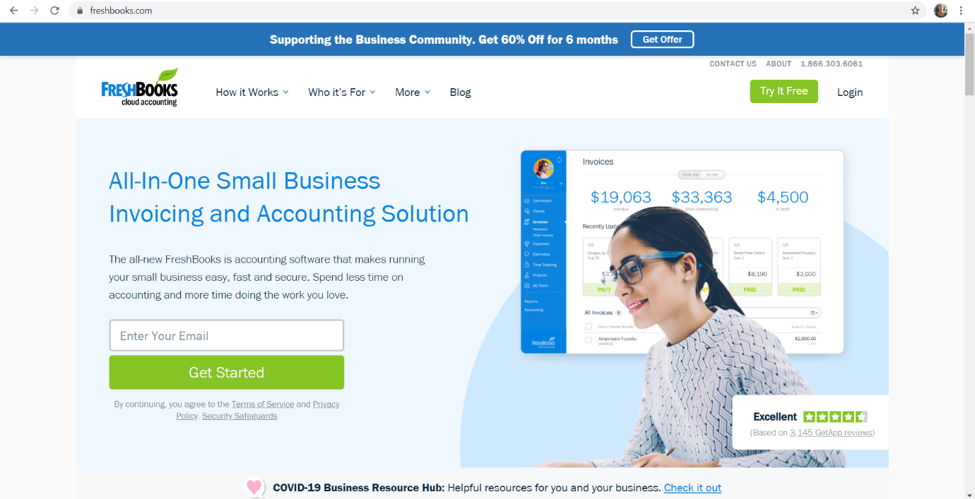
If your homepage design can answer these questions, the visitor will be able to understand what the business is all about and will look forward to what you have to offer. FreshBooks is doing what is needed. Their homepage design allows the visitor to get all the information in just a glance.
Freshbooks’ approach towards answering these questions is by using them as their menu tabs. ‘How it works’ and ‘Who it’s for’ will answer your question and also lead you to their next page.
2. Communicate with your audience
A homepage design should be able to send a compelling message to your visitor and gain their attention for them to stick around on your website. Stick to the 15-second rule. If you manage to capture your visitor’s attention with exciting illustrations and videos that strike an emotional chord in their minds, rest assure they will remember you over any other website.
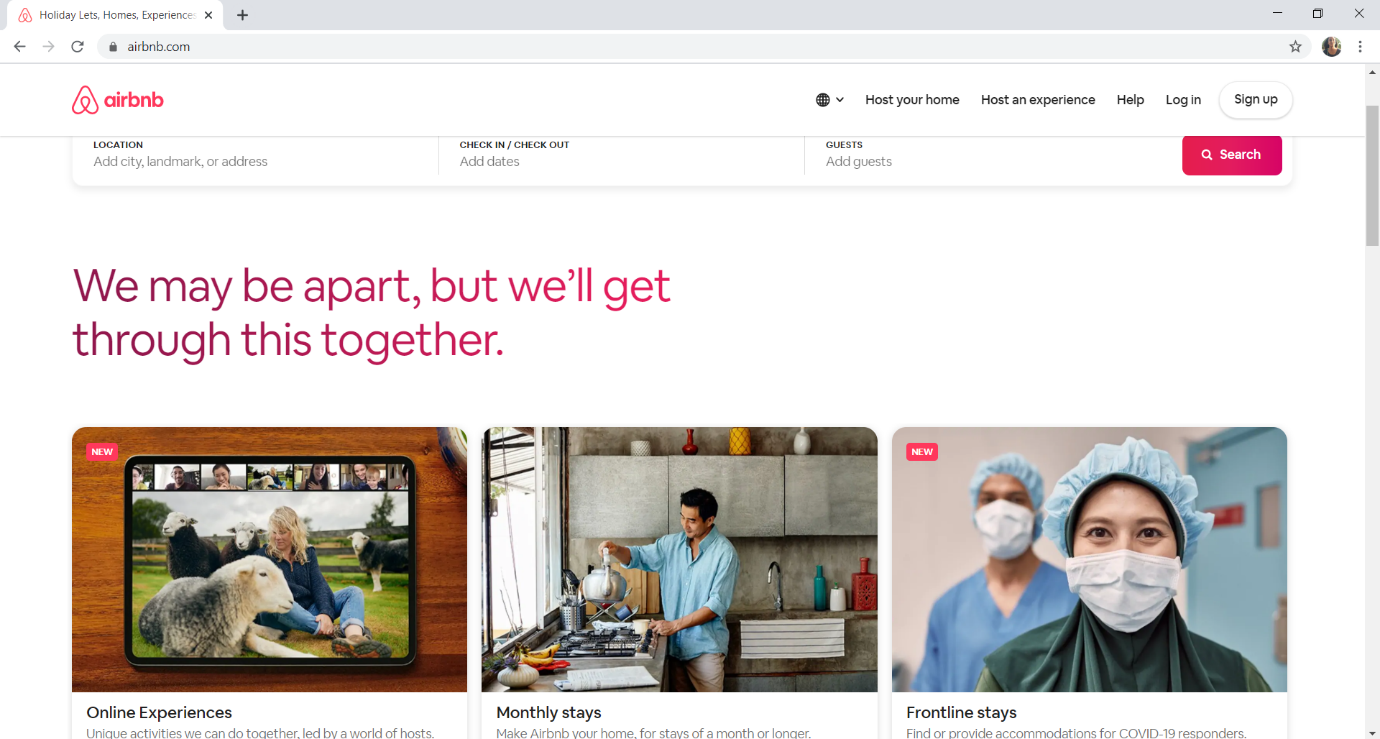
Airbnb is an excellent example in this case. It manages to capture the audience with the use of language. Currently, their website homepage consists of a very catchy tagline “we may be apart, but we’ll get through this together,” and this gives the visitor a feeling of togetherness and motivation when they browse through their online experiences amid a crisis. Never underestimate the power of an impactful tagline.
3. Clear navigation and access
Homepages must have clear directions leading their visitor to make the desired action. If the visitor is confused and cannot find their way around the website, it leaves a negative experience of the brand in their minds—approximately 19.3% of the conversion rate decreases due to unclear navigation.
Your homepage design needs bold and crisp headlines and titles to avoid negative feedback. Choose a pleasant color that resonates with your brand and use a contrasting color to help your titles pop out. Clear navigation means labels and menus that precisely lead your visitor to the desired page.
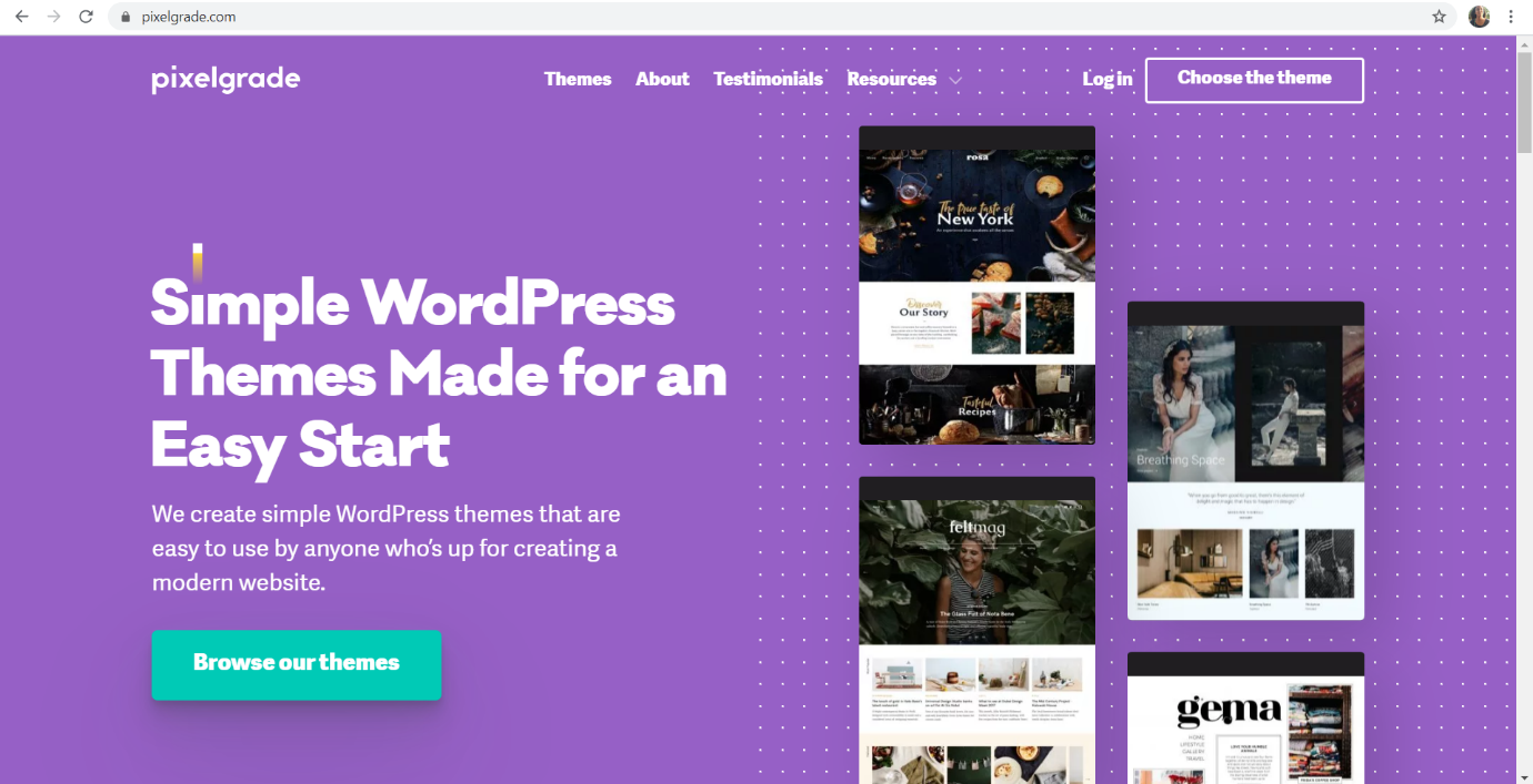
For example, Pixelgrade gives its visitors well-defined menu bars like Themes and Testimonials, etc. which indicate what exactly that page holds. It’s easier for the visitor to browse and look for information on the website.
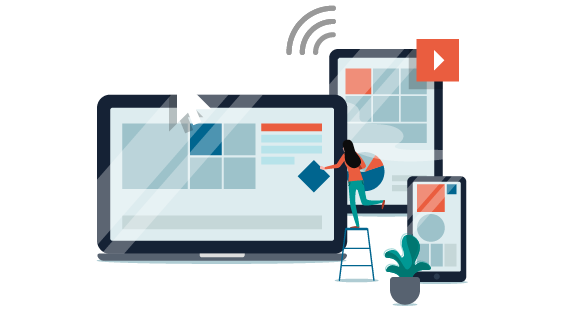
4. Responsive Format
It is not unknown to us that numerous individuals use their phones over any other gadget to browse through information these days. The fact is that 57% of website traffic generated is on a mobile phone. You got to be where the visitor is.
Therefore your website must have a responsive format that will allow your visitor to browse through your website on any gadget, irrespective of the screen size. The homepage design layout will appear differently arranged in a mobile as compared to a desktop, to suit the accessibility of your visitor.
For example, Chipotle’s website adjusts itself according to the screen size of the gadget that the visitor is using. One image is of the webpage browsed on a laptop, and the other is on the phone. The only difference is the alignment of the elements; everything else remains the same.


5. Appropraite CTA
The whole purpose of a website is to compel the visitor to make an action, and CTA stands for Call to Action. If your Homepage manages to define a specific CTA, like ‘Subscribe Now’ or ‘Buy Now,’ the visitor knows what to do and has no confusions whatsoever.
Charity Water does a brilliant job of grabbing their visitor’s attention towards their ‘Donate’ and ‘Learn More’ button and compels them to click on it and support the cause.

To summarize these elements, an effective homepage design should have-
1.Creative Layouts
2. Definitive Labels and Menus
3. CTA
4. Pleasing color scheme
5. Engaging visual content
6. A unique identity
A useful and engaging homepage needs to have the elements mentioned above, but what also matters is how you place the elements around the page. Imagine your webpage to be a blank white space before you start designing it.
Now with all the aspects that we listed, you have to paint a beautiful picture called the Homepage. The placement of these elements determines the layout of your Homepage.
There is a range of layouts to choose from, and here I bring to you eight arrangements that will work best for your Homepage design.
8 Inspiring Homepage Design Examples
1. The Zig Zag Layout
This layout gets its name from the way your visitor’s eyes travel across the Homepage. Let us break it down to understand the eye movement better:
1. The eye starts looking from the left to the right of the page
2. Then it comes down and moves from the from right to left
3. And back across to the right
Try it out for yourselves, and you’ll be surprised to know just how your eye moves through content and determines a homepage layout.
2. The F Layout
This format also gets its name for the way visitors skim through the page. Observations prove that visitors tend to:
1. Start reading from the top left of the page
2. Next, they scan the top bar of the page
3. Then move down and read again from left to right
4. And finally, browse the text when they get to the columns
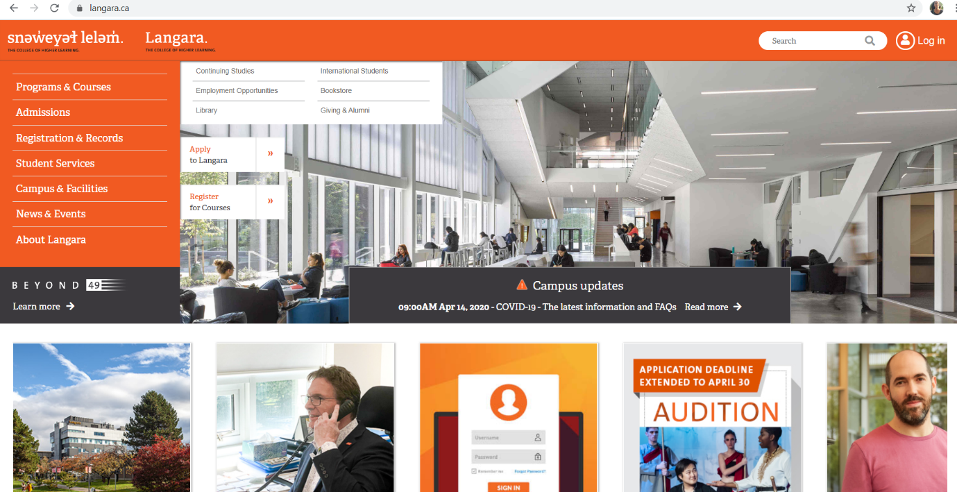
An excellent example of this layout is the Langara university website that precisely follows the F-layout to their advantage. Their brand name is at the top left of the page where the eye looks first and then moves down to the left where they display all their courses and amenities.
It makes it so easy for the visitor to skim through the page and get the information required without a fuss, just by following a particular behavioral trait to design their webpage.
3. Full-screen photo layout
This kind of layout showcases a full-screen picture that serves as a background for your homepage design. In this case, it is a necessity to choose the right image for your background. The image you select must resonate with what your brand message is. Putting up a random picture won’t make any sense.
Eu travel tech uses a video as a background for their Homepage, which manages to draw your attention towards it. They also keep their information bold and a dull white color that is noticeable to the eye without much effort.

4. Featured image layout
This particular layout is similar to the full-screen design because it has a picture as a background, but the difference here is that the image is the focal point of your blog or your website. It is advisable for personal websites, freelancers, and blogs because it allows the visitors to know what exactly you are about to tell them. The image itself is the source of meaning for your website.

5. Split-screen layout
Split-screen design is when we divide the full-screen layout into two vertical halves. This layout allows for more precise placement of messaging and pictures. It is a perfect fit if you are looking for a minimalistic approach to your homepage design without using bold elements all over the place.
Engine Themes is a great example to understand this layout. The two halves of the page have distinctive designs and speak for themselves.

6. Grid Layout
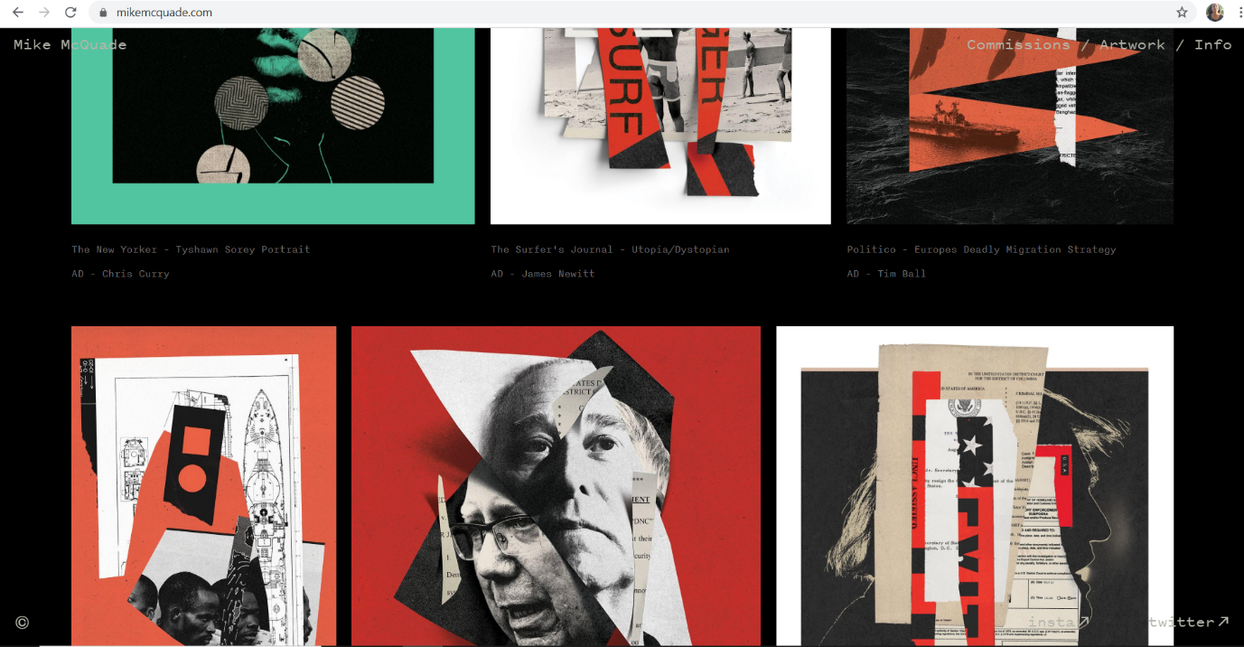
A grid divides the layout into vertical and horizontal guidelines to incorporate margins, columns, and rows to help organize your content on the Homepage. It helps in creating a uniform structure rather than a haphazard one. Grids are also psychologically pleasing. MCQ is an excellent example to understand the grid layout.
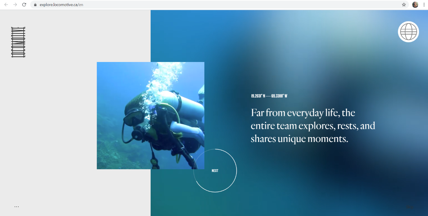
7. Asymmetrical layout
Asymmetry means a lack of symmetry. Symmetry is a safe choice, but asymmetry in your design will make your brand stand out and give it a unique identity. We see asymmetry all around us, but when it comes to designing your Homepage, asymmetry will help you arrange your content is such a manner that allows for the essential material to be placed in the middle of your page. Locomotive’s website plays around with grids and asymmetry without compromising on giving you the information.
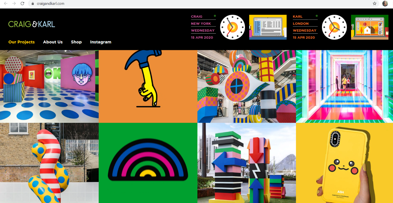
8. The headline and Thumbnail Layout
In a world where visuals play a vital role, this layout will be beneficial for any website. It features small images leading to the full descriptions of the topics. It is most suitable for travel websites and magazines—for example, Craig and Karl.
Conclusion
You see, designing a homepage is no rocket science. With a few tricks and inspirations, each one of you can make your homepage design the best out there. To summarise everything, your Homepage must have a definitive introduction about your brand, excellent communication, clear navigation and access, responsive format, and an appropriate CTA. Remember, just dumping all these elements on the webpage won’t make it great, but applying a layout to it will work the magic. Choose a layout that best suits your brand identity and get started.

Permalink
Permalink