
Different screen sizes call for changes in how we design a website. Without a responsive website design, your site may look disoriented when viewed on various devices. Images might blow up or look pixelated, or text may be too small to read.
Inconvenient right? Such inconvenience could lead to falling numbers in your visitors. The solution to all your problems is a responsive website.
You can expand your reach and user experience by using this approach. In simple terms, responsive website design enables a site to adjust to screen sizes regardless of the device used.
Why do you need a Responsive Website Design?
Responsive website design adjusts your site to different screen ratios. It changes the fonts, images, etc., depending on the screen size.
In other words, It reduces work. Traditional ways asked designers to create separate designs for each device. With this new approach, work has reduced, and experience stays the same.
Responsive website design equips your site to respond to multiple screen sizes on its own. The ultimate goal is to avoid excessive zooming, scrolling, and resizing by visitors.
But why use responsive design at all? Here’s why.
The latest stats say, 53.3% population has shifted to mobile phones as their primary source for browsing. It means more people are moving to smaller screens, and this trend seems to continue.
If your website is not responsive, it will look haphazard on smaller screens. Responsive website design puts all the components in place. With adjustable text, image, and layout, it makes the website easy to use.
Let us look at some responsive website designs that have accomplished the task. They keep the design intact while enhancing user experience.
20 Responsive Website Designs to Learn From
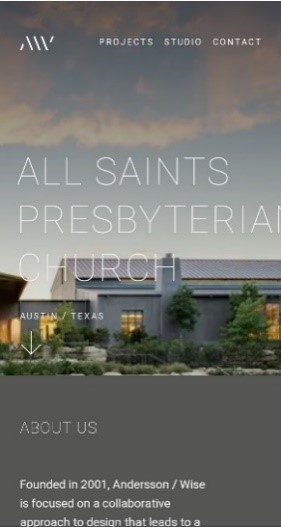
1. Andersson-Wise
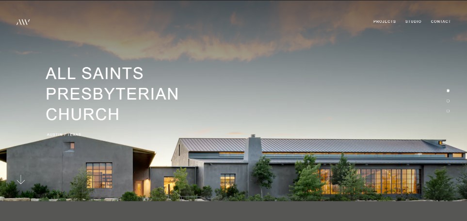
Andersson-Wise is an architecture and design website. Three distinctive sections divide their website. Demarcating the segments, are neat lines and grids that allow for negative spaces.
On a desktop, the background scales across the screen, leaving no borders. Their projects section is displayed using grids with beautiful pictures of their work.
Scrolling and a few clicks give you all the information. Likewise, on a smartphone, the website design is relatively similar. Three sections and all text is left aligned. Fonts resized to suit the screen width, and the grid layout remains constant.
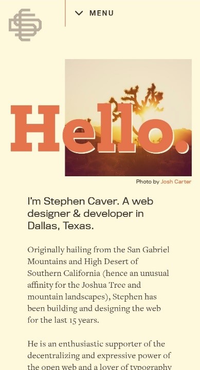
2. Stephen Caver
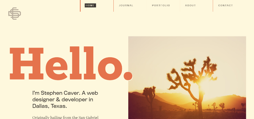
Stephen Caver is a website designer and developer. His website is the perfect example of engaging website design.
With welcome messages in bold fonts, his homepage follows the rule of thirds with the fonts using two-thirds of the frame. As we scroll, he places his portfolio in a grid.
He leaves white spaces on his website when viewed on a desktop, and distributes his design across the larger screen. Whereas on a mobile screen, the text is left-aligned and follows the flow throughout the page.
3. FOOD SENSE
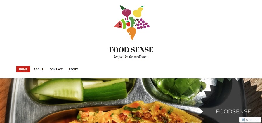

Food Sense does not follow the conventional blog format. On a desktop version, the logo takes up two-thirds of the frame.
Instead of a grid layout for her articles, they use the thumbnail layout. Pictures of their dishes placed adjacent to one another lead you to the recipe when clicked.
When browsed on the phone, the layout is identical but scaled down to fit the screen size. Images appear as stretched on the desktop while on a phone screen, they look more composed.
4. The Boston Globe


The Boston Globe is an apt example of a newspaper website. It’s desktop version has multiple columns spread out like a broadsheet.
Where the desktop website looks like a physical one, the mobile version is a left-aligned format. Excluding headlines, which are sometimes center aligned.
The phone version gives you the important news first because the design calls for a single column. Whereas, on the desktop, multiple columns, allow you to choose what you want to read.
5. Forefathers Group
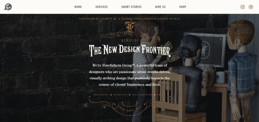

Forefathers Group is one of the most sophisticated responsive website designs I have come across.
Using the striking gothic font style has lifted the website to higher levels. Space out across the screen; their website homepage is mesmerizing.
The use of typography with engaging text and graphics pulls together this website. The mobile version of the website is no less than the large-scale one. Only the layout differs, which here is center aligned.
6. Dropbox
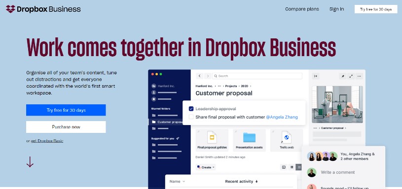

Dropbox uses a flexible grid and visuals to make their responsive website design standout.
Background colors change as the user shifts from one version to another. Image size varies as well to fit the varying screen sizes.
An arrow directs the user to ‘sign up’ on their website version. On the contrary, a CTA replaces it on the mobile version.
On the desktop version, Dropbox spreads its content across three columns. And when using a mobile version, it features a single column.
7. Magic Leap


Magic Leap is a fascinating website. Video as their background for all versions, it grabs attention at once.
User experience remains constant across all devices with Magic Leap. The website follows the same layout, no matter which device you use.
The only difference is the scroll button on the desktop version. Whereas it is absent on tablets and phones. That is because its only natural for mobile users to scroll.
8. Smashing Magazine

Smashing Magazine gives its users a tailored experience across multiple devices. Using a two-column layout for their desktop version gives them the freedom to use white space.
With an elaborate menu bar for their large-screen version, the menu bar is absent on the phone version. Instead, a dropdown box features the list.
It claims to load within 2 seconds with a 3G network connection. Quick load time reduces their bounce rate and keeps their visitors happy.
9. Slack
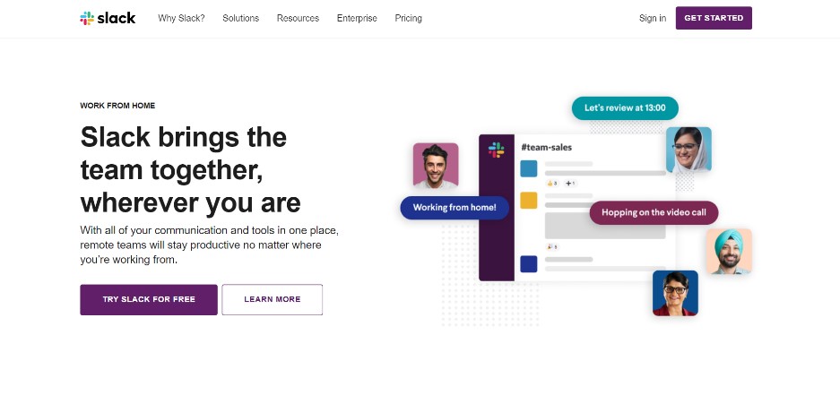

Slack’s website is simple and customer friendly. They reduce clutter on their sites, making content the prime focus.
Their responsive website design follows a flexible grid layout. It adapts seamlessly to changing screen sizes.
On desktops and laptops, their customer logos follow a three-column layout. Whereas, on handheld devices, it features in a single column.
10. Wired
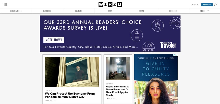
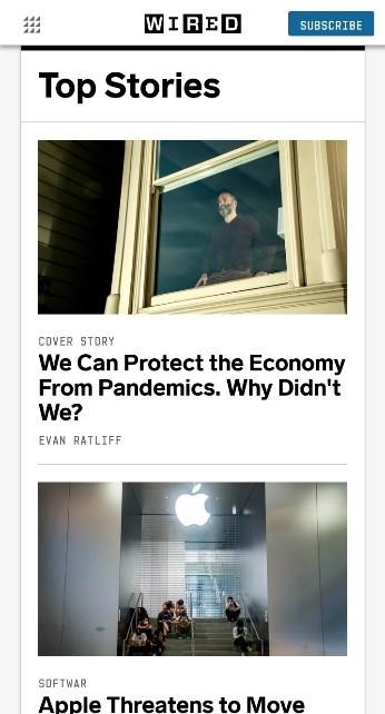
Wired’s website is a dynamic one. It uses multiple columns and sidebars on their desktop versions. And handheld devices allow for a single column.
The smaller the screen gets, their elaborate menu bar shrinks to just their logo, menu button, and a CTA.
On desktop devices, customers can search and filter their news. This function is absent on mobile devices.
Conclusion
Responsive website design is the future of all business. With mobile phones reaching every corner, your website will do so too.
Reduce the hassle of pinching screens to adjust the page. With responsive website design, your site can do it on its own.
You need not have all the features on the mobile version. Include only those that are necessary. Minimize clutter to get maximum attention on what you want to say.
Faster load times will reduce bounce rates, and more visitors will engage with your website. The attempt is to keep it simple and accessible.