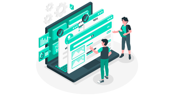
While we have been discussing WordPress websites and templates, let us not forget its counterpart, Wix Websites. Wix is a world-renowned cloud-based platform for web development.
Websites built using Wix are one of the best among their kind. It comes with 100+ designer-made templates and is free of cost. With drag and drop website editor and customizable designs, it is as good as a WordPress website.
It is also mobile-friendly and entirely SEO optimized. Wix guarantees free and reliable hosting with features packed to the brim. Wix websites are no less than any other developing platform.
Why compare when you can have the best of both. Here I will help you analyze the design options that Wix websites have for you. Then the choice is yours.
10 Wix Website Examples to Inspire You
1. Animal Music

Animal Music is one of the best Wix websites to analyze the design. It is minimal yet bold and unique. It comprises of all essential features: the logo, an engaging header, menu bar, and a grid layout.
Animal Music uses videos as their homepage background. This technique draws the viewer’s attention immediately. As you scroll down, the screen turns black, and the text appears.
They maintain a readable font and minimal information. Throughout the website, you will rarely find any text. Animal Music lets the images and videos do the talking.
As a portfolio website, priority is to showcase their work. A two-column grid layout, with large images, serves the purpose. It is the simplest yet the most engaging website design.
2. Linda Franzosi

Linda Franzosi is a Wix website with a parallax effect. Mainly a portfolio website, the design helps you showcase your work effectively. The design is no less than beautiful and looks professional.
Here, Linda Franzosi’s picture serves as a background for the entire website. Over it, the contents pan out using the parallax effect. The website jumps between a split-screen layout and a full-screen layout.
She switches to a split-screen layout for her about’s information and clientele. This Wix website template employs a grid to display her portfolio.
Not to forget the Contact section on her page. It plays as a contrast to the light colors of the website and makes it pop. The bright colors make them visible and easily readable. You can also book a Skype call and free consultancy by clicking on her unique CTA.
3. Sonja Van Duelmen

Sonja Van Duelmen is a versatile Wix website. The home page is a striking one due to the pop of color and white text. White serif text over a colored background never goes out of style.
This website applies a crucial typography principle– use limited fonts. Throughout the site, you will find only three font styles in total. Serif fonts make the headlines, and sans serif fonts for the copy.
Sans serif fonts are more readable than serif fonts. Therefore, the copy must be in sans serif fonts. The website has text evenly distributed across the page to avoid cramming.
The majority of pictures on this website have movement. To portray every service, they use sliders with images and bold text. The use of negative space makes it more attractive.
4. Brown Owl Creative

Brown Owl Creative is a website design agency, which built its website with Wix. Wix websites surely have a vast array of templates for every need. Our previous examples were portfolio websites; this is a business website.
For a business website, the logo is crucial. Therefore, with this template, your logo is at the top left corner. The menu icons stand equidistant and at the top of the page. The text is their mission statement, and a CTA leads you ahead.
Following is a grid layout to display their portfolio. The choice of color is another crucial aspect of this website. White and blue are the two dominant colors on their website. Their pictures add the other colors to the page.
When we reach the bottom, ample negative space lets you focus on the services. The same colors build the brand association, and a compelling CTA wraps it up.
5. Hilary O’Leary

Wix website templates can turn into just almost anything. Here is a Wix website for a wildlife photographer, Hilary O’Leary.
We know for a fact that pictures are the heart of a photography website. Therefore, this template features a full-screen image layout. The homepage is a majestic picture and a faint text.
Most importantly, the homepage has the social media icons at the very beginning. Remember how every photography website should interlink their social media handles and sites.
The website has lots of exciting features like the split-screen ‘about me’ section. Similar to that of Linda Franzosi. Following is a four-column grid with stunning pictures. That is her portfolio.
Further down, we find more full-screen pictures that have some quotes and contact details. The bottom section has products from the shop and a CTA asking you to buy now.
6. Seven Grams Caffe

Seven Grams Caffe is a Wix website that is an ideal example of a café website. The enticing header is no less than captivating. With the logo in the center, it helps to increase brand recognition.
As you scroll down, the website follows a zig-zag layout. These sections feature their services that also appear on the menu bar. Such a template is more comfortable for the viewer to browse all the information.
Pictures are essential here too. The zig-zag layout gives the page a unique look and supports eye movement. They also have a CTA attached to the ‘The Bakes’ section that is allowing you to order now.
This Wix website also has a gallery option. A single slider has pictures of tasty goodies in a row. And when you view all, its arranged in a grid layout. Their testimonials appear in white over a black background. Simple and sweet.
In the end, Locations is presented simply over a picture of theirs, making it more inviting.
7. Two One

There cannot be a more straightforward Wix website than the Two One. Using an asymmetric design for their homepage, it resonates with their target audience—the youth.
There is ample negative space on their website. The homepage page is these pictures placed asymmetrically with a graphic element and CTA.
The menu bar is at the top right of the screen, and their social media handles too. Focusing on Instagram as their star platform, posts appear in a grid layout.
Lastly, it asks you to sign up for their newsletter and provide their Instagram handle. Single black on white text with minimal copy.
8. Tobias Becs

The Tobias Becs Wix website follows the featured image layout. Since the focus of this website is the footballer himself, the homepage puts him in the limelight.
The social media icons appear on the right end of the screen. Design-wise this decision is a wise one. The eye moves from the logo at the top left to the icons o the right. Placing the icons there implies the importance of his handles.
He uses videos and images on his website, and text is minimal and highlighted over a black background. It looks clean and striking. Finally, the contact page appears over a full-width picture of his.
Interestingly the Menu bar at the top right corner seems to travel with you as you scroll. At the bottom, an arrow leads you back to the top. Common in most Wix websites.
9. French Knot Studios

The French Knot Studios is a Full-screen image Wix Website. The page doesn’t require a lot of scrolling. That is because the homepage layout is just the image with the logo at the top right end of the screen.
To explore further, you need to click on the icons on the menu bar. Those pages, too, follow the same layout—image sliders as headers and some text to wrap it up.
As minimalistic as it sounds, the focus is on the images. It is a unique approach to a wedding photography website. Their portfolio is a set of pictures based on themes, arranged in a grid layout.
The French Knot logo also serves as a redirecting icon. You may be of any page, and clicking the logo will bring you back to the homepage.
10. Cuts and Bruises

Cuts and Bruises barbershop is an example of how versatile Wix websites are. The name of the store is bang in the center to catch attention immediately. Now you won’t ever forget the name.
The typography and the black background add to the brand identity. Fonts are the highlight on their homepage. It also has two circular CTA buttons. Very unique and simple.
Scroll down to see their services. Each one below the other, with a center -align text format. Here, the copy is the hero. Further down, their social media posts serve as their portfolio. There are a few videos, too, and a little about the team.
By using the parallax effect, the logo comes on with their contacts page and a Google map to find them. Overall a unique and engaging Wix website.
Conclusion
Regardless of which web development platform you use, your goal is to create a professional website. From the examples, we analyzed how Wix websites have proved to be one of the most popular ones in terms of design.
Every Wix website had some things in common. One of them is the arrow at the bottom of the page. This reduces the need to scroll again to reach the top. Minute details like this add to user- experience.
Large headers are common to Wix websites. For websites that need to grab attention under three seconds and make an impact, these are the best. Although Wix has premade templates, you can always customize them.
There are umpteen platforms on the internet that serve as website developers, but it is essential for us as consumers to weigh them based on our needs.