Every Graphic designer is only as good as his/her last project. Proof of all your best work comes together in a graphic design portfolio. Freelance designer or a reputed one, both need clients. And what clients need is proof.
Only when you see will you believe. Right? That makes it necessary for every designer to exhibit their work on a platform. A design portfolio is what you will need.
A graphic design portfolio works as a resume for designers. It is the first thing your client will see before approaching you. They are a bunch of design deliverables that a company presents on a platform like a website or their social media handles.
The sole purpose is to draw in customers by showcasing your work, which makes it even more critical. A graphic design portfolio decides whether or not you are good enough. In that case, we will help you make an impressive one.
5 Best Graphic Design Portfolio Websites.
1. Heather Shaw
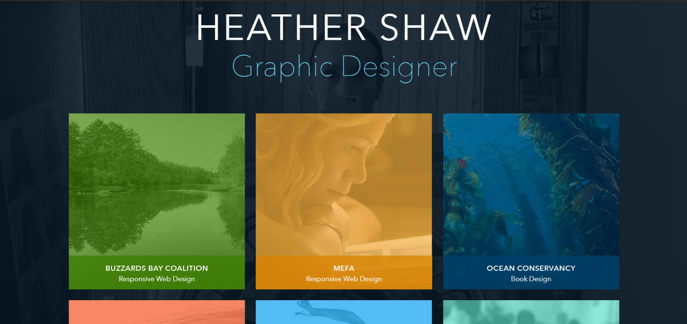
Heather Shaw is a graphic designer with over 20 years of experience. With the skills she acquired, her designs are beautiful and passionate. From books to brochures, business cards to websites, she designs them all.
Her graphic design portfolio is her website homepage. A black and white full-length picture serves as the background for it. The image has a darker hue to make the text visible.
Her work features in a grid with soft color squares to make it pop. Neat arrangement and minimal use of books draw attention to these boxes. Each box leads you to the page with the project and her experience.
With her design portfolio, she proves that less is more.
2. MDZ Design
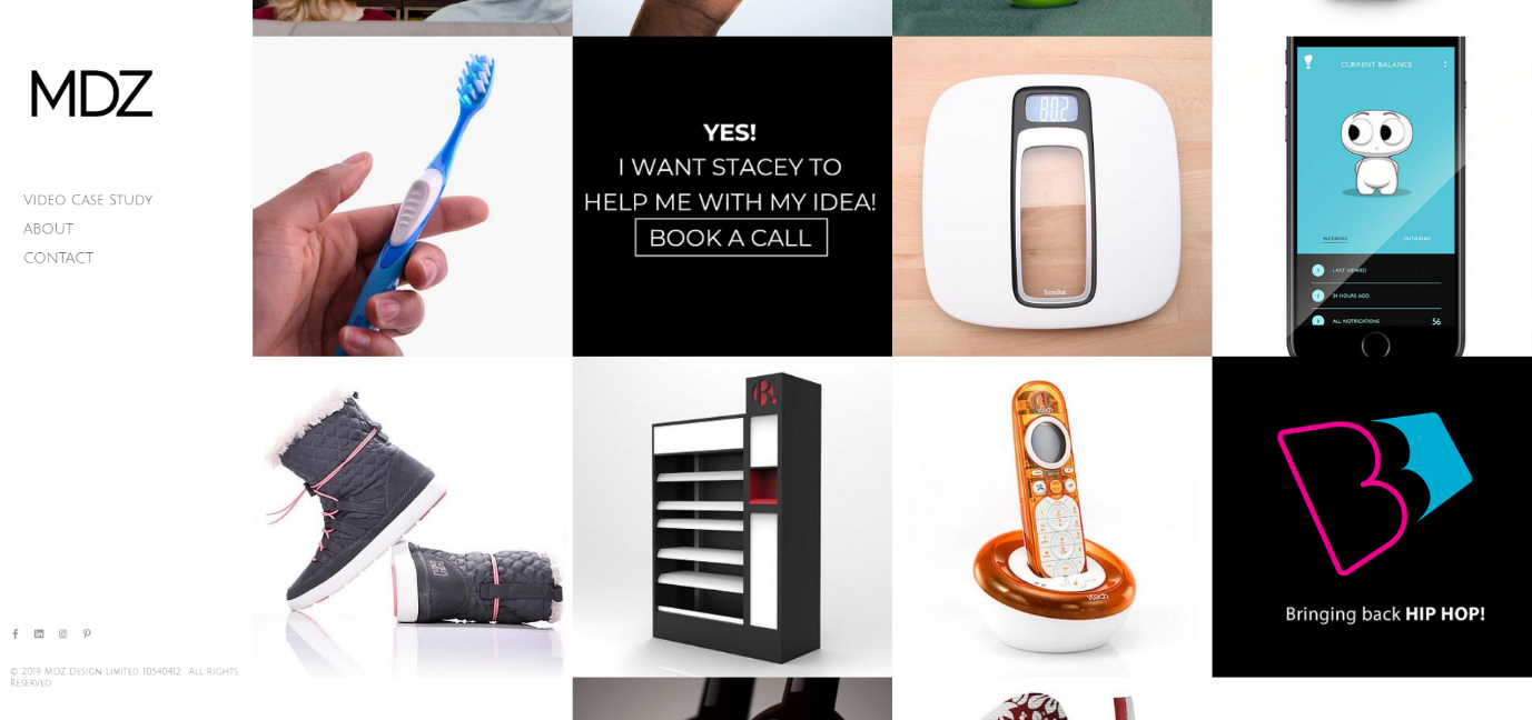
Stacey Mendez is the name behind MDZ Design. She has worked with brands leading their markets for 10+ years now. Her Graphic design portfolio is diverse and covers her best work.
She has over 55 projects, but only her best ones make it to the collection. MDZ Design’s homepage is a white background with nearly placed thumbnails. Each thumbnail box carries her clientele and the product.
A red filter appears when the cursor hits each case. The click leads you to a page that explains her product approach. An exciting feature is the Book a Call thumbnail. It is a smart use of blending in with the design.
3. Kate Moross
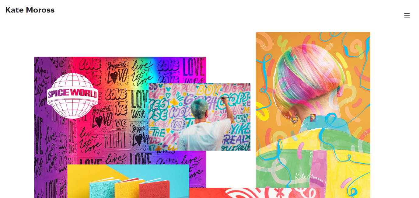
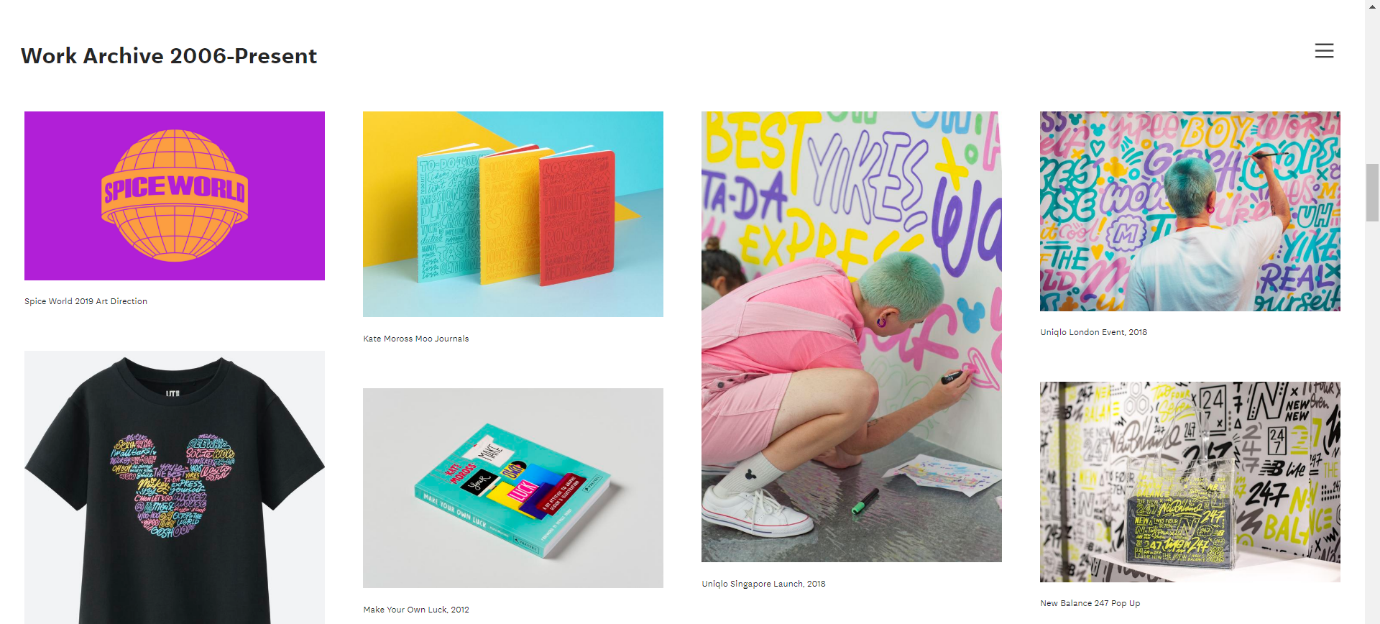
Kate Moross is a British designer whose portfolio screams unique. She is known for her handwritten typography. Her graphic design portfolio carries all her work from 2006 to date.
From creating night club flyers, she now illustrates campaigns for big brands like Google, Nike, etc. What makes her graphic design portfolio so interesting is the placement of pictures.
One overlaps the other, yet doesn’t confuse the viewer. She also uses a lot of negative space on her website. This technique allows her doodle designs to stand out.
The ‘Work Archive’ on the website is her Graphic design portfolio. With evenly spaced out grids of varying sizes, the designer displays her unique style.
4. Pawel Nolbert

Pawel Nolbert’s graphic design portfolio is a color bomb to your eyes. He does not leave any space open. With tightly packed boxes and elegant colors, the page looks full.
Lack of white space between these images work at his advantage. His graphic design portfolio clearly states his strong point- color. He has worked with brands like Adidas, Apple, and Nike.
His designs are unique to every brand, but his style ties them together. His brush stroke texture and choice of colors lift his designs. Pawel Nolbert is a color artist and aims to create visually sharp images.
5. Lauren Hom

Another one of the typography designers is Lauren Hom. She specializes in hand lettering to create her design. Her graphic design portfolio is versatile and vibrant.
The collection, Lauren Hom’s website features have her best designs, which have varying fonts and styles. This graphic design portfolio uses negative space to separate the boxes.
Negative spacing between them allows you to focus on each design at a time. The image sizes are correctly balanced, making them individually appealing as well as a collective.
After seeing the best Graphic Design Portfolio, it’s time to make your own. Here are some tips you want to keep in mind while building your portfolio.
How to build your own portfolio?
1. Have a single but significant element.

Your graphic design portfolio must be impressive. It presides over your name. It is vital to draw your client’s attention to the design alone. A full graphic design portfolio distracts the viewer.
You do not want to do that. Having a single significant element will help draw attention to nothing else but that. This element could be your product, like in the case of MDZ Design. Stacey Mendez places a component in one box to make it the focus.
The key is to KISS. Keep It Simple, Stupid.
2. Keep enough negative space.
Negative space means the space that’s left empty. In most graphic design portfolio websites, negative space is essential. Negative space draws your attention to the primary focal element.
With enough negative space, the page will look even distributed and neat. Some designers use negative space to place their text. Anything that appears on the negative space will be the focus.
Remember that negative space is not just space; it adds to the page as a whole. It can create borders around your designs, making them look less congested.
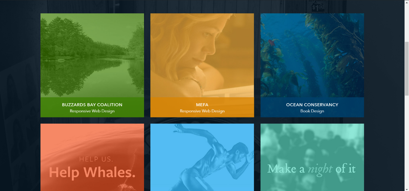
Like Heather Shaw’s websites has enough negative space to make her projects the focus. Give your designs space to breathe.
3. Gather the best work.
A graphic design portfolio is a designer’s resume. And you want to put only the best stuff on a resume. Then why not apply this logic to your portfolio? It is no compulsion to put all your work out there, only the best.
Choosing from your work can be difficult. Try to be versatile. Include projects from different industries to expand your reach. If the result is not satisfactory, do not put it on your portfolio.
Your graphic design portfolio should reflect your style. To choose wisely, remember that client satisfaction is paramount.
4. Organize your work.

Organizing is always better than randomly placing your work on a page. There are multiple layouts to organize your work—for example, the grid layout.
MDZ Design and Pawel Nolbert presented their portfolio in a grid layout. Though they leave no space in between two grids, it works in their favor. Otherwise, Lauren Hom’s portfolio is also useful.
Varying box sizes to present your design. In contrast to the grid layout is Kate’s portfolio layout. Such an arrangement, if balanced, looks good or makes the portfolio look confusing.
5. Give it some personality.
Persona makes you stand out. There may be loads of graphic designers, but none like you. Your design portfolio should speak that unique style.
Like Pawel Nolbert’s unique brushstroke style, his portfolio reflects that skill. It gives you the impression that he is no ordinary designer. Kate Moross’s website expresses her personality effectively.
She has her pictures and quotes featuring in her portfolio. It is a brilliant way to infuse herself in her graphic design portfolio.
Conclusion
Graphic design portfolio websites are a must for a designer looking to expand. It is fair to say that only the best should be on your portfolio. Give it some room to breathe and organize your work better.
With an impressive Design Portfolio, it’s your time to get set and design.


