Every Ecommerce website is different from the other. Therefore, it calls for a unique ecommerce website design, as well. In any case, the essential elements remain the same. For every successful E-commerce website, simplicity is key.
You do not want your visitor to go off your site, the moment it opens. The design enhances user experience and convinces your visitor to hang in there. Let us look at these elements that make a good ecommerce website.
5 Essential for an Ecommerce Website
1. The user is the priority.
Every detail on your ecommerce website must be according to the user. Keeping your users in mind, decisions like how you place your product comes handy.
Your user also influences the style and personality of your brand. This personality needs to reflect on your website, as well. Blume, for example, asks its users what they want.
2. Do not confuse the user.
You must be careful of adding only what you require. Too much can often distract your user. Minimalist designs go a long way and communicate better.
With too much going on, your user might lose the purpose of your website. Bacca is an excellent example in this case. Its minimalistic website design draws all your attention to their product.
3. ‘View cart’ button.
An ecommerce website must allow you to stack what you wish to buy. With a view cart button, your customers will know when they go over-board.
Giving them this option will make your website customer-friendly. Make sure this button stands out. Not Another Bill is an ecommerce website that has a gift box for a cart button. It attracts the eye immediately.
4. Innovative CTA.
CTA (Call To Action) button plays an essential role in your ecommerce website. After all, that’s what drives your visitor to make a sales decision. A compelling CTA will gain attention and compel you to click it.
You can add them anywhere noticeable on the site. Pop-up Call To Actions is a good idea too. Simply Chocolate uses great CTAs to draw a user’s attention.
5. Navigation menu.
The navigation menu of your ecommerce website is like a guiding light. Put all that is necessary on the navigation bar. It should have things like contact about us, etc.
This menu helps direct the visitor to the product page. A simple navigation menu does fine, but you can experiment. The Owl places their navigation bar differently. This move works in their favor.
Now that we know what makes a good website let’s look at some ecommerce website that has used simple techniques to make theirs look even better.
20 Best Ecommerce Website Design Examples
1. The New York Times Store
What sets apart the New York Times website is the typology. They use fonts that appear typically in newspapers.
Font choice gives the site a feel of what the brand stands for. The products, neatly arranged in a grid, make shopping easier.
2. Rebecca Atwood
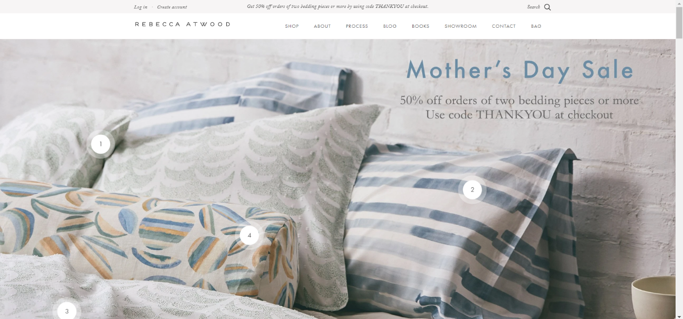
Rebecca Atwood’s website homepage features her designs. Being a textile designer displaying her designs is essential.
The exciting feature here is the ‘click to buy’ option. The numbers on the products lead you straight to the product page where you can buy them right away.
3. The Owl
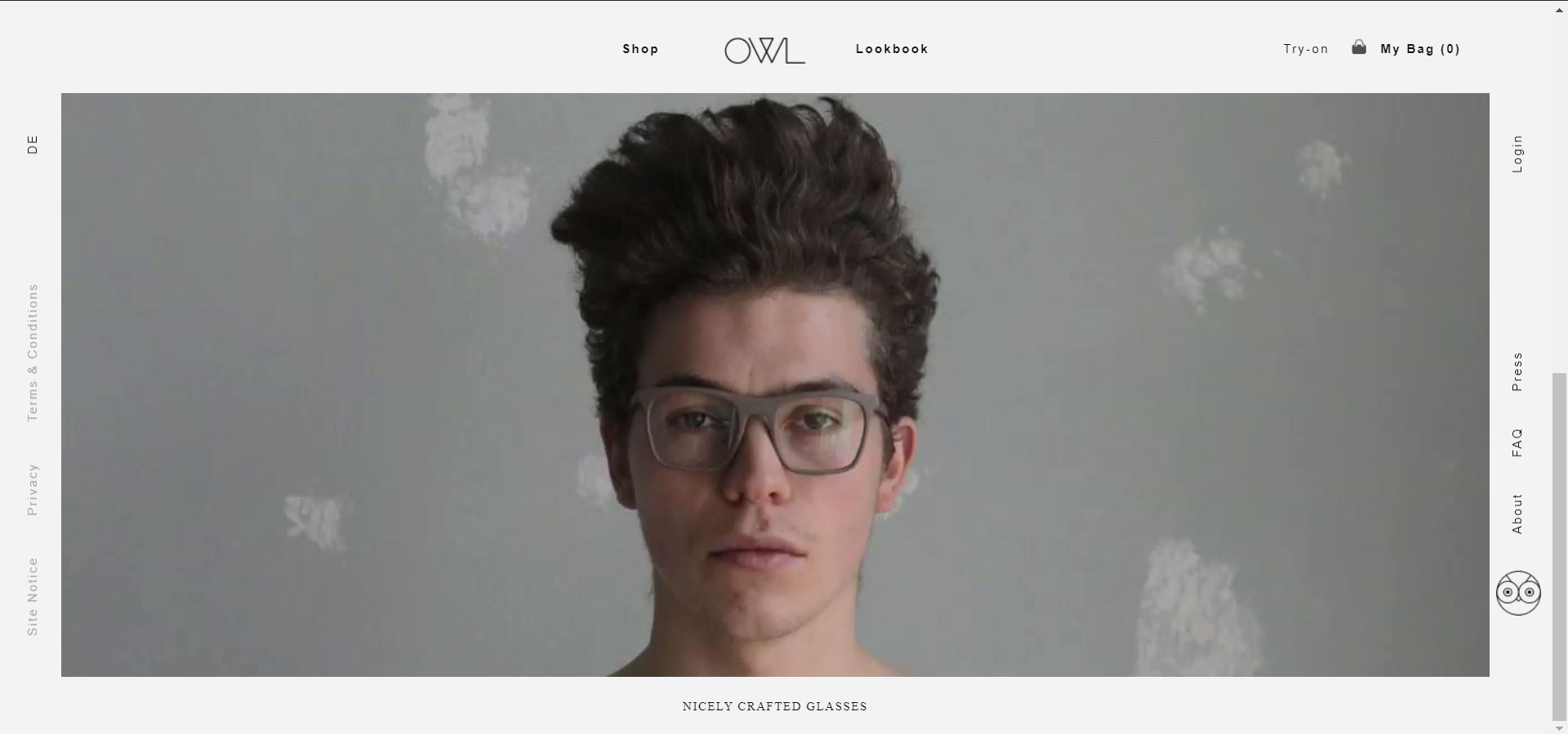
The Owl uses a strange layout to place their menu bar. Usually, it is on the top right of the page. They choose to put it on the right and left of their page.
It works in their favor as it draws attention to the auto-played video. Sometimes white space helps the design.
4. Two Chimps Coffee

As the page loads, the graphics on the page sort of form in front of you. Clever use of unique graphics and language helps connect with their audience.
An exciting feature on the website is its pop-up CTA. They allow you to buy a sample before placing a full order.
5. Really Well Made
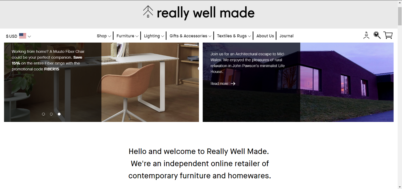
Really Well Made are a furnishing and decor website. The product display follows the grid pattern. Pictures of products, on the site, play a significant role here.
Really Well Made incorporates their Instagram feed to their website. This kind of association is an excellent way to promote your social media accounts to your clients.
6. Via Copenhagen
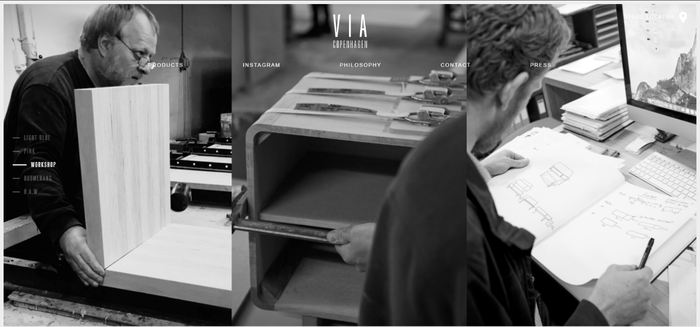
Via Copenhagen’s stunning color palette makes the website pleasing. What makes it interesting is the fact that it scrolls for itself. Pages seem to slide up to display their hand-crafted pieces.
Their simplistic menu bar features‘ Philosophy’. This page features the process of creating each piece of furniture. Such a feature will increase brand affinity.
7. Buffy Comforters
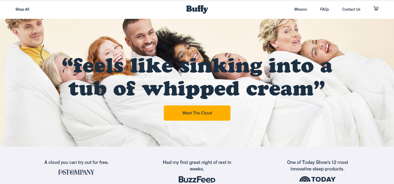
The first thing you see on the website is that slogan. Buffy Comforters manages to pull your attention to the picture that stretches across the page.
Such an emotive slogan and photo makes you crave for the same feeling. Just when you spend enough time dreaming of owning one, Simply Chocolate’s discount pop-up appears. Now you have to hit the ‘buy.’
8. Simply Chocolate
Simply Chocolate is like no other chocolate website you would’ve seen. With its remarkable user experience, this website is a joy to browse through.
As you keep scrolling, the chocolate paper unwraps and reveals the product. It stops when you reach the CTA- ‘Take a bite.’ With excellent website design, this brand succeeds in enticing their visitor.
9. Teenage Engineering
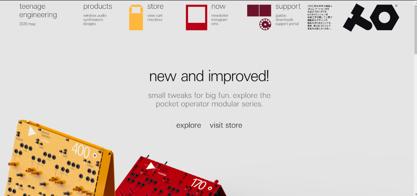
Teenage engineering sure lives up to its name with the feel of their website. It is one of the best-designed engineering websites.
What interests us here is that all of it is in lower case. It signifies that you don’t need upper case fonts to prove a point.
10. Bacca

Teenage engineering sure lives up to its name with the feel of their website. It is one of the best-designed engineering websites.
What interests us here is that all of it is in lower case. It signifies that you don’t need upper case fonts to prove a point.
11. Triangl

Triangl sells swimwear, and it does it uniquely. Instead of the typical grid with products on hangers, they have models to do it. Each piece is displayed to show you exactly how it will look on your body.
Considering the most critical factor for swimwear is fitting. Triangl uses an exciting way to engage with their customer.
12. Read-only memory

Read-Only Memory publishes books about video games. The website itself has a video game-like design.
The placement of products here adds to the feel and attracts their target audience. Their website design is quirky but enjoyable.
13. The Goodwell Company

The Goodwell company website grabs your attention as soon as the video starts to play. As you scroll down, you see what the site has to offer in a neat grid layout. White space works well for them in this case.
14. Blume

Blume is the one self-care website that asks you what they need. As you scroll, there are three options to choose from, after which they present their products. Categories separate their products.
15. Recess
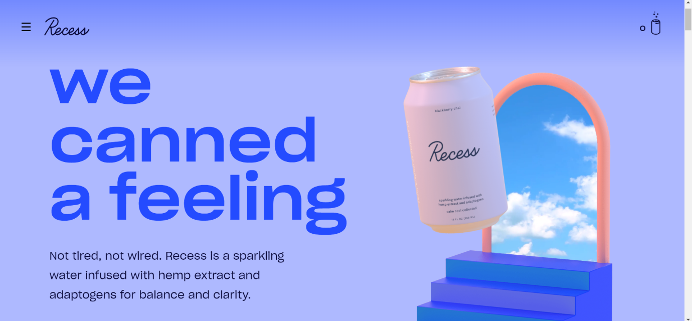
This can of sparkling water will surely make your head feel light. The clouds in the background, add a pleasant view to the eye.
This website is a superb example of how copywriting can lift your website.
16. Topology
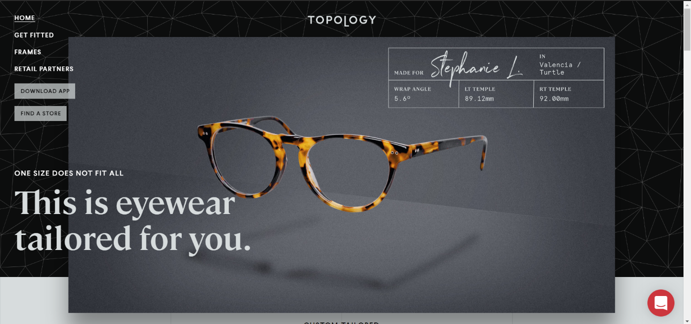
Topology Eye-wear does a great job of customizing each frame. On Topology’s website, graphics depict the process of making the perfect pair of glasses.
With a striking logo, this website is a unique one among its kind.
17. Popbar
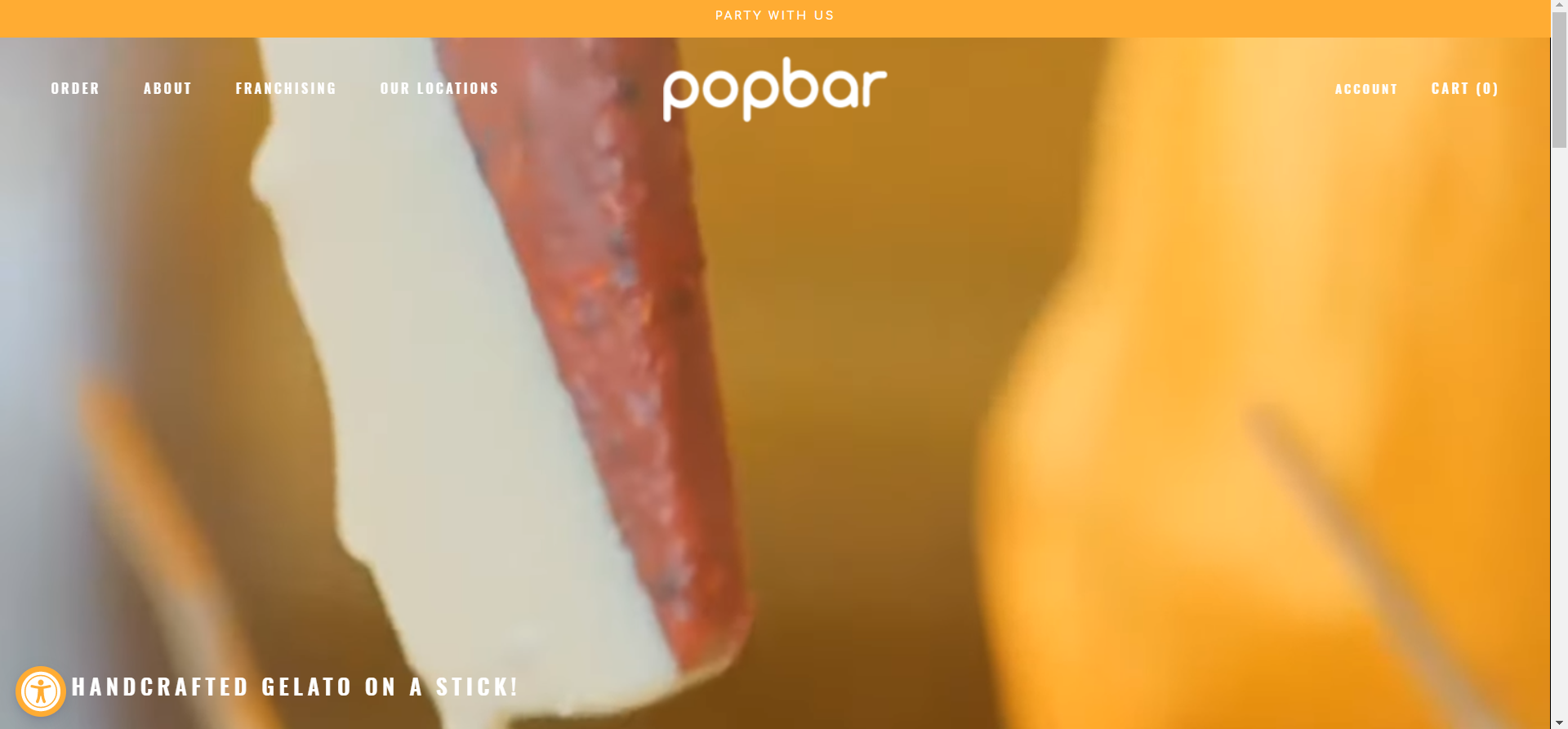
Popbar website is a paradise for every ice cream lover. The enticing video playing in the background, makes you want to take a bite right away. The vibrant use of Popsicle thumbnails gives you all information you need.
18. Skull Candy

Skull candy is a renowned brand. The website follows a striking yellow color this month to boost feel-good moods. Minimal text but bold images make this website pop.
19. Bliss
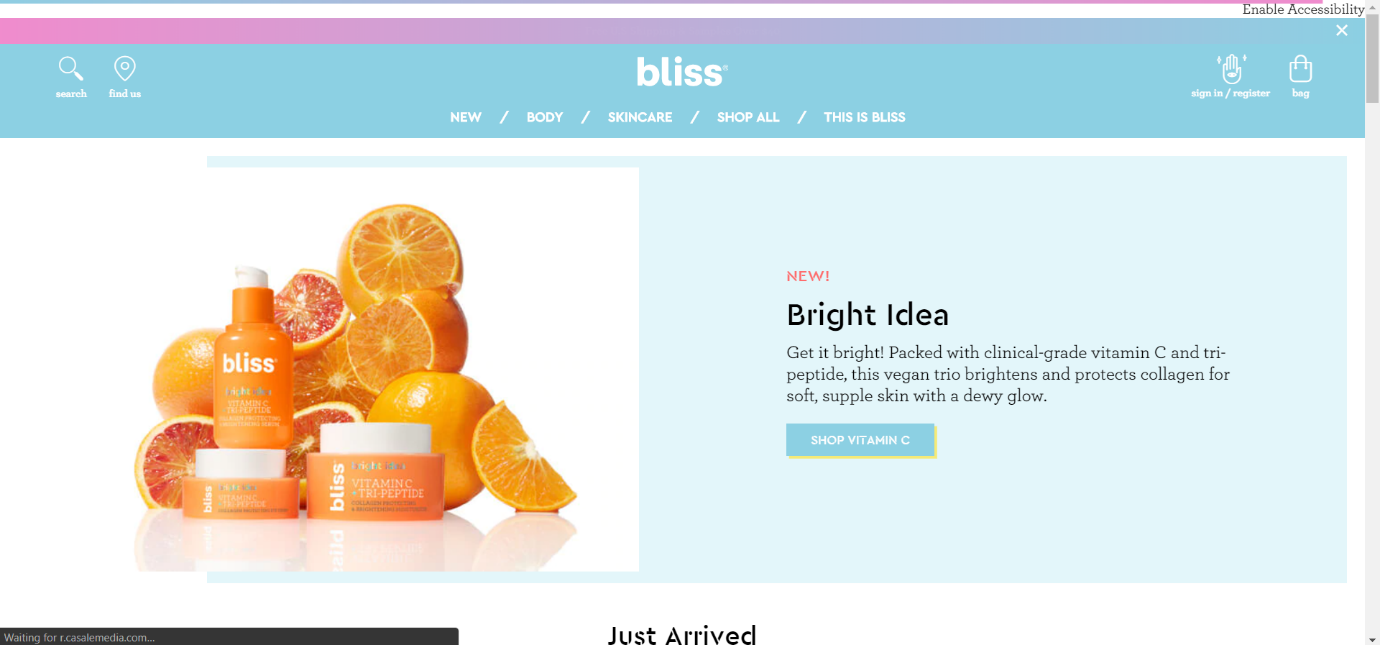
Bliss is another self-care website but gives a different vibe. The site follows a category wise placement, all products belonging to one category lined up together, unlike grids.
20. Decibullz

This website makes sure you do not confuse it for earphone manufactures. Instead, Decibullz makes earphone adapters that help them fit better. Their website has videos and pictures depicting the users of these adapters.
Conclusion
Every ecommerce website looks to increase sales. It is not a complicated task if you stick to the basics. The key is to keep it simple.
Easy Navigation to avoid confusion. Attractive CTA and Cart button. Above all, a design that suits your brand in the best way possible. If your website communicates with the audience, consider your mission accomplished.
There might be a million online stores on the web. Make sure your ecommerce website tops that list.

